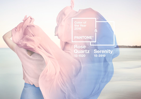
What is the pantone colour of the year 2016?
For 2016 Pantone have released not one, but two complimentary colours of the year. This is the first time the inconic company have selected a dual colour scheme, Rose Quartz & Serenity. On the pantone site they state, "Rose Quartz is a persuasive yet gentle tone that conveys compassion and a sense of composure. Serenity is weightless and airy, like the expanse of the blue sky above us, bringing feelings of respite and relaxation even in turbulent times."

So what does this mean for shutters?
So last year was big for pastle shades and it looks like this is due to stay in a big way for 2016. While previous years have been majorly focused on bright and daring colours, these complimenting pastles show a more elegant and subtle approach.
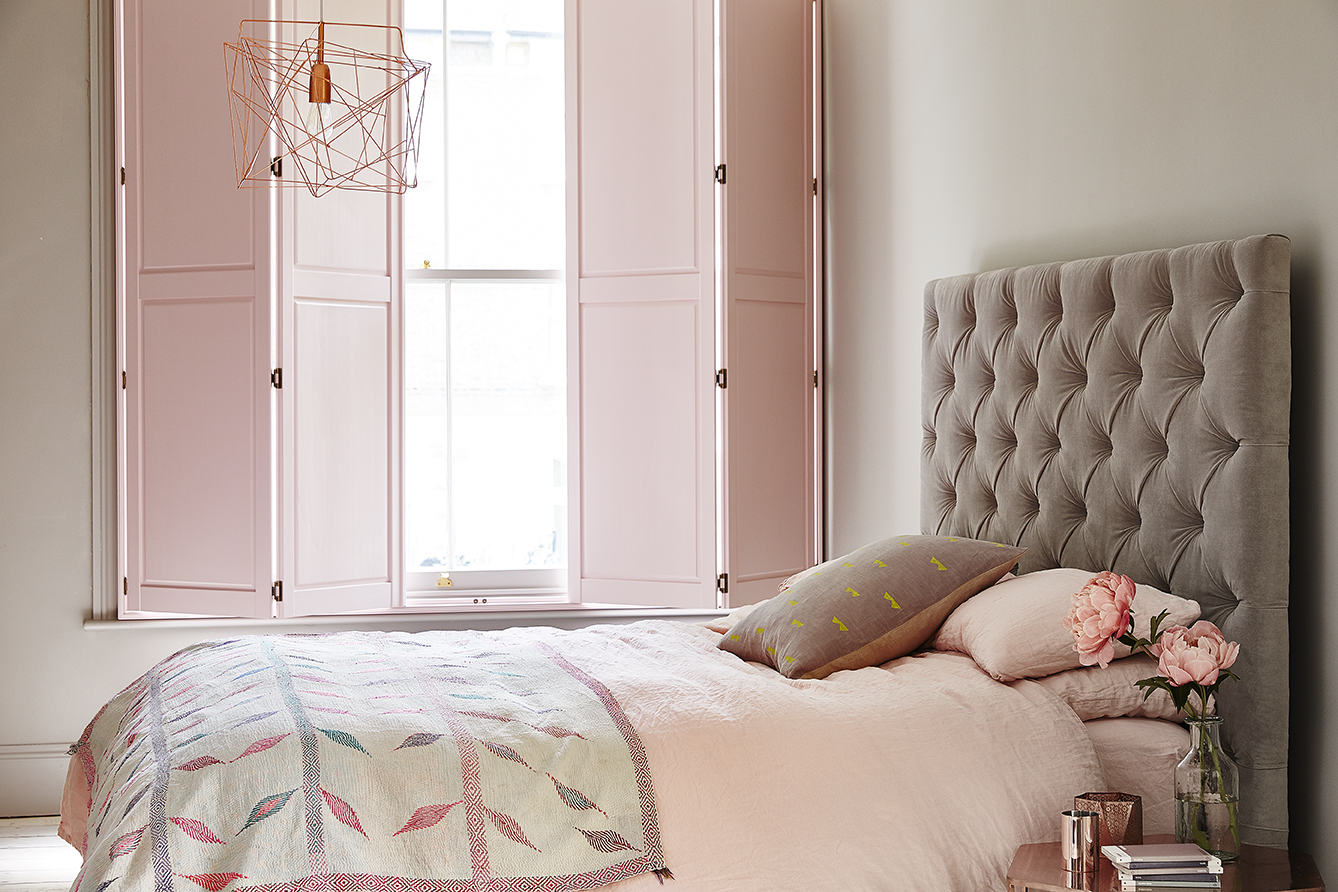
We've been focusing our designs into pastles for the last year and it appears it's paying off, we love these solid bedroom shutters. Finishing off a mainly while room with a pink shade incredibly close to pantones own selection of Rose Quartz. Hopefully this year we'll see more subtle designs and people taking advantage of our colour matching service to design their perfect pastle shutters.
